The Keys To Effective Architecture
When you think of a great city park, what gave off a strong impression? Was it the green grass, the birds flying by, the fresh air? Or was it the landscaping, monuments, bridges, pathways, water fountains, pruned bushes or meticulously carved out waterways? All in a compound that that is often perfectly square and looks like it was designed on AutoCAD? Despite the veneer of nature, our most beautiful parks are actually some of our most artificial creations.
Nature is not an orderly place, but in humans (at least in Western cultures) we have an innate attraction to orderly things; to the “perfected” versions of what natural places could be.
Think about the Castle you see before every Disney movie. Nothing about this castle is all that practical. It has high walls, multiple levels, sky bridges, parapets and spires everywhere. It even has a friggin’ river flowing through the middle of it for some reason, and even that river has its own perfectly maintained hedge wall. Yet something about this castle inspires awe and wonder. It’s almost like a magic trick.
There’s something about the idealized versions of things that creates an impression. A beautifully designed building can leave a powerful impression and help to set the area apart. This is as true for restrooms as any other structure. In this article we’ll talk about some of the ways you (and/or your architect) can create a beautiful restroom building. Here are some things to keep in mind:
Shape
Shape is often the first thing we notice about an object. An attractive, interesting, or whimsical shape is a great way to get noticed or to complement the vibe of the surrounding area. In this section, we’ll illustrate some examples of bold shape choices done well:
Any restroom that exists in a beautiful metropolitan landscape will need to live up to a higher standard of attractiveness, but this Best Restroom nominee goes above and beyond to not only match the surroundings but to exceed them with an attention-grabbing appearance.
The building’s hexagonal shape is a key feature as is the flat overhang glass roof. This shape was a surprising but intelligent choice as hexagons are more interesting to look at than a square. Since restrooms rarely have more than four sides, the decision to go with six sides furthers the goal of having this restroom stand out and be noticed. Placed in an area where there is a lot of competition for visual attention, this restroom still stands out, and in a good way.

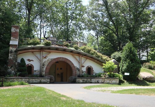
This Best Restroom nominated restroom- located at a botanical garden- made a creative choice to go with a large, circular outer entry. Passing through a large stone and brick circle creates a den-like feel, almost as if the restroom has a protective shell around it. This outer shell appearance has the restroom feeling more insulated- making it seem more welcoming in windy or stormy weather.
Looked at from a wider view, the restroom appears to be a homage to The Shire from the Lord of the Rings. This lends a whimsical, fantasy feel to a place that compliments the idyllic surroundings. Anyone who sees this building will be drawn to it so as to investigate it further.
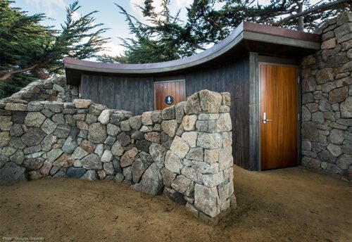
Another Best Restroom Award nominee, this restroom stands out almost exclusively because of an incredibly unique shape choice. The placement of this oblong, curved restroom against a stone wall creates a feeling of strength and insulation, as does the stony screen wall in front of it. The door being tight against a stone wall makes the building feel strong and secure, almost like a bunker.
This style is not easy to recommend as it would be incredibly difficult for modular construction given how awkward it would be shipping a building like this on the back of a truck. Though the more difficult a project, the rarer it will be and the more it could stand out. Hats off here for pulling off a tough restroom design successfully.
Size
An attractive building that is small will leave a good impression, but a similarly good-looking building that is larger will impress even more. A larger building could also have added utility- as a longer roof overhang provides extra shelter from the elements and taller buildings can have larger windows that provide better natural lighting.
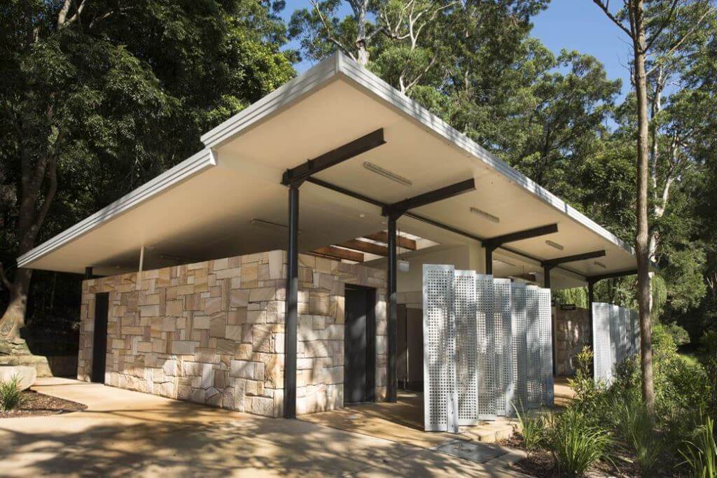
The above example taken from Blackbutt Recreation Area in Australia takes this concept and runs with it. A series of metal columns look almost as if they are prying open the roof; and the tall screen walls almost feel like a part of the building itself as the roof nearly hangs over them. The result is a building that feels even bigger than it really is, and the design feels modern too. It’s cool to look at.
Flair
Business formal attire such as the suits worn in Mad Men can be attractive and stylish, but they’re also a bit ordinary. There’s nothing wrong with that, sometimes being ordinary is appropriate. Architecture is much the same way. Maybe you just want a nice looking, restroom that doesn’t stand out.
However, if you want a restroom that makes an impression, it would help to do something out of the ordinary, particularly if you can do it with skill (like many of the examples in this blog article). It’s not just structure either, but accessories can help make your restroom stand out as well.
The only limit here is our imaginations. Here are some examples of restrooms that were made to be a little different:
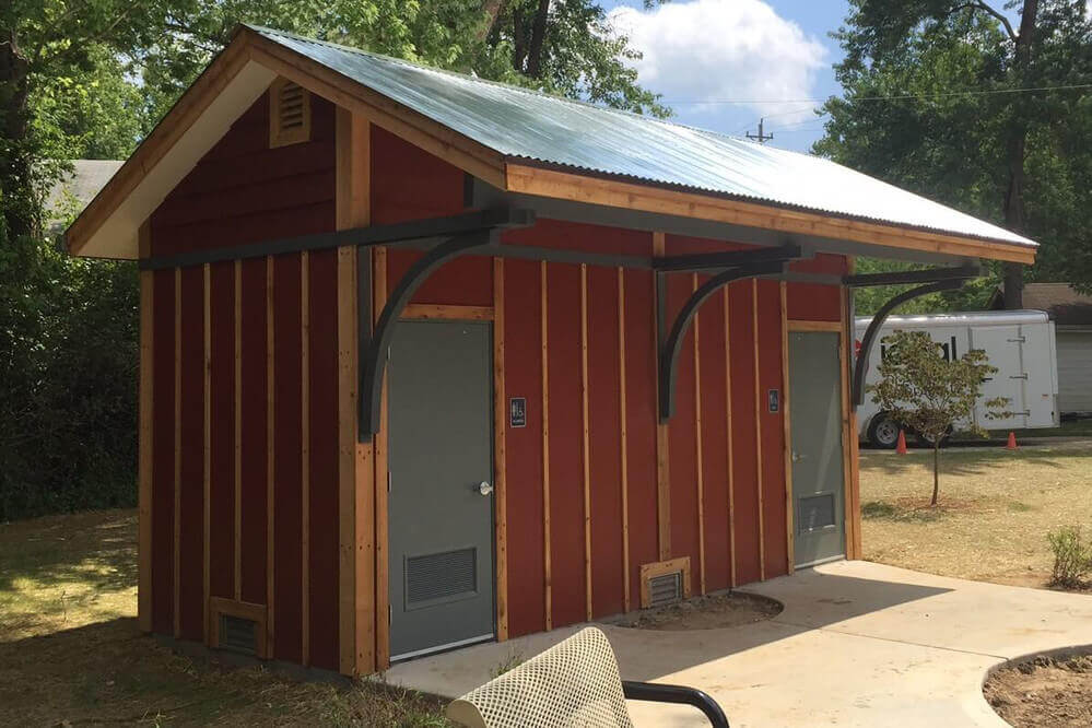
This Green Flush restroom in Wildwood, Missouri was designed to look like a train depot. Imagine this restroom does not have the arcing roof supports on the front of the building. Does it still remind you of train depot? Probably not. Everything else about the restroom is fairly ordinary, but that one detail completes the building stiring feelings of nostalgia for a building we might otherwise ignore.
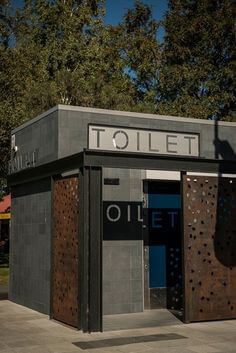
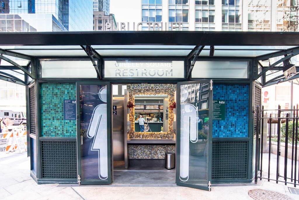
The metropolitan style signage of this public toilet is pretty cool, but if you look closer, there is something a little extra here that is even more impressive. The “T-O-I-L-E-T” letters above the entryway are cutouts, allowing sunlight to pass through and imprint the same word on the restroom wall behind it.
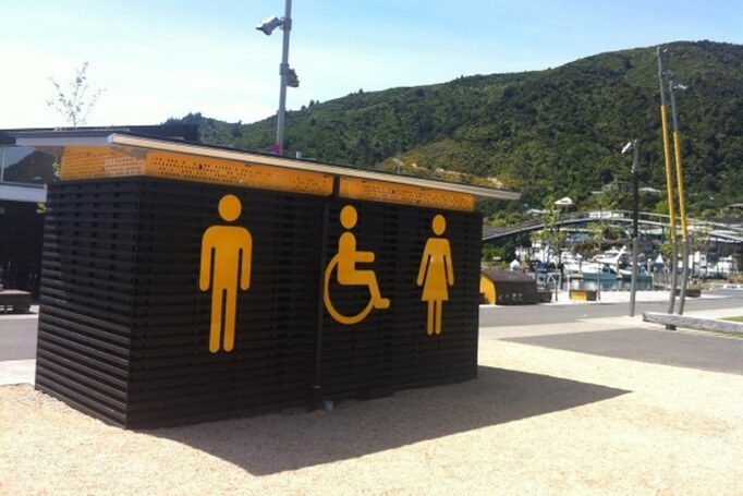
You’ll never have to wonder where the men’s or women’s sides are located with this restroom. Of course, the choice to go with this appearance was probably for another reason- this restroom wants to stand out and get your attention. People will know from a mile away where the local public restroom is. Nobody anywhere nearby is asking “where is the restroom?” Having to be asked this question way less is a nice win for the locals, too. The building is also stylish and visually striking with the interesting use of black stripes and yellow symbols.

This Green Flush restroom from Marietta, Georgia proudly displays the town’s logo on a crest above the door. The logo is attractive because it fits in with the color scheme and theme of the building. By associating a nice public restroom with a symbol of the city, it creates a degree of civic pride.
Finishes
Finishes are what we see on the surfaces of our buildings. Examples include wood, brick, metal or painted surfaces (we previously discussed siding options here). Finishes are can help compliment the shape and design of your restroom to convey the look you want. Or, if the architecture of a building is unambitious, the right use of finishes can help make a building more attention grabbing and interesting.

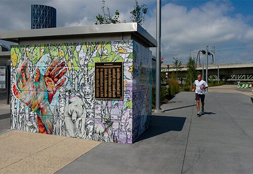
These aren’t two different restrooms. This Best Restroom nominee is covered in murals which wrap around the entire building. Even more impressive- these murals are changed to something new months later, again months later after that. It is an ever-changing piece art for the public to enjoy.

This Green Flush restroom on the Gila River Indian Reservation features a mural that tells the story of the nearby river of the same name that is the lifeblood of southern Arizona. This building isn’t just a restroom, it’s a canvas too.

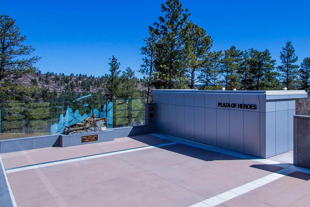
This Green Flush restroom was installed at a memorial located at the Air Force Academy. It was important that the restroom blend in with the motif of the surrounding structures by using the same siding material and style. The overall look is both sleek and modern. Visitors would never know this restroom was built in a factory over 1000 miles away.
Color
Color is famously connected to us emotionally and psychologically. Think about the colors that you see on signs or stoplights. These colors were not chosen at random; they were chosen because they get our attention and create a desired response.
For architecture, colors can highlight separate spaces, create positive emotions, or be symbolic. The symbolism could be as basic or straightforward as matching school colors at a university, or it could more subtly convey the desired mood to match or compliment the surrounding environment.
Color alone won’t make your restroom beautiful, but a wise choice of color can be like a secret weapon.

This Green Flush restroom completes an idyllic scene at Texas A&M University’s golf course. The restroom is colored to match the school theme while still fitting in perfectly with the surrounding natural beauty. Color is an easy way to brand a restroom, tie it to the space, and endear it to those using it.
Interview

Of all the buildings we found researching this article, perhaps no example checked more boxes of having interesting architecture than the one found in Steamboat Springs, Colorado. We spoke with David Hoffman of the architecture firm Gerber Berend Design Build, the group responsible for designing the public restroom, to learn more about the process behind the making of this restroom. Here is what we learned:
Before construction, there were no existing public restrooms in the area despite having many businesses, high tourist traffic, a farmer’s market, and even a nearby rodeo grounds. The need for a public restroom was significant.
“The original concept was to do an off-the-shelf, basic restroom,” David said. However, as Steamboat Springs is an affluent ski-resort town, “businesses in the area wanted something more dressed up.”
The typical precast concrete restroom solution lacked more than looks; they also had the problem of not meeting energy code. A precast concrete restroom would be unusable in the winter (a busy time of year for a ski town). Steamboat Springs recognized that this would not be an easy restroom solution, so they came to David’s firm for help.
The design process started with functionality: what size building would fit into the available space? The area was highly developed and a nearby creek further boxed things in. This led Gerber Berend to opt for two single occupancy cabins.
The firm then consulted with Steamboat Springs maintenance workers to best determine what fixtures would be optimal for cleaning and upkeep. The suggestions included urinals, which then made it more practical to make the restroom cabins non-gendered. After figuring in the necessary accessibility, the floorplan process was complete.
With the floorplan finished and the materials accounted for, the last thing to decide on was the design. The simple unisex restroom floorplan and limited space was restrictive, but Gerber Berend still found ways add wow factor to the building.
The firm wanted a “mountain modern aesthetic” that would fit in with the local architecture. “Board form concrete is sometimes done on the exposed concrete in residential projects in the area,” said David. This process used aspen wood planks that were sandblasted to enhance the texture. The combination with the metal for the top portion and in the soffits further establishes the mountain modern look while the color scheme complements the unpainted, rustic concrete walls.
The restroom’s most peculiar feature is its butterfly roof, but as David points out, “there’s a history of butterfly roofs in Steamboat. We also wanted to control runoffs.” The extended roof makes the relatively small building feel grand while providing shelter as people exit and enter the restroom.
Form meeting function was clearly a theme with all aspects of the building, even with the metal view blocker in front of the restroom. The view blocker provides some extra level of privacy for folks entering and exiting the restroom, but not so much that it would encourage sleeping in the restroom or other unwanted activity. The metal plank design matches that of the local bus shelters furthering the branding of the community’s public structures and signaling it is a public facility.
In many ways this restroom feels avant-garde, yet every design choice stems from a functional need, making it that much more impressive. This restroom is a great example of what any public restroom design should strive to achieve – meeting all of the client’s functional needs while seeing how those needs can create design opportunities that will complement the community.
If you are looking for a restroom that is more than a mere amenity, our team would be happy to consult with you about how to make your restroom a visual asset to your area.